The Performance page in the dashboard provides granular performance information about an overall site, and each circuit at that site. The Performance page is one of the most useful tools in the dashboard in that it displays specific connectivity problems and the times they occur. It accurately identifies latency, loss, jitter, and other symptoms of circuit degradation.
The information is beneficial when troubleshooting issues with ISPs, showing precisely where the performance issues are, when they occurred, and how long they lasted. The Overall section on the Performance page shows the combined performance of all ISP providers for a site.
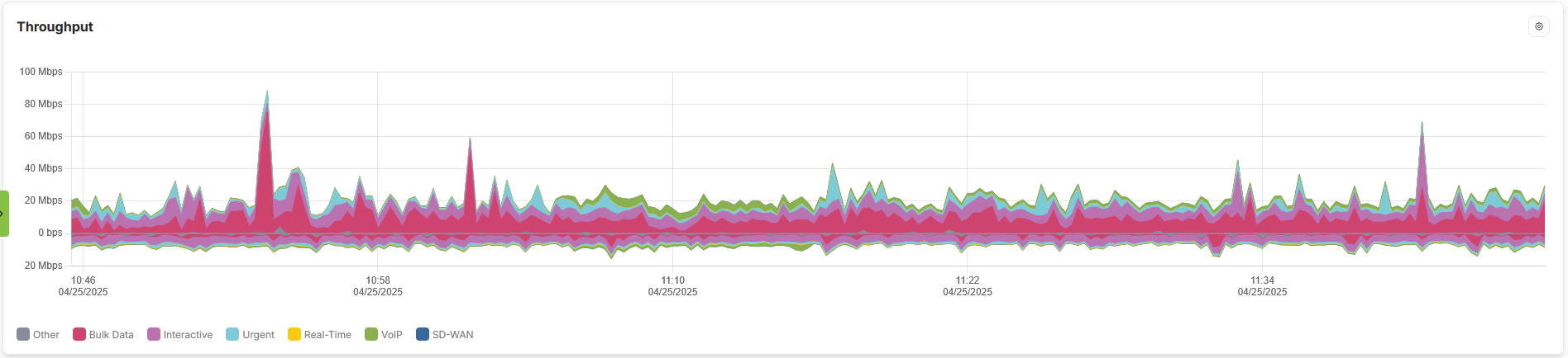
On all graphs on the Performance page, traffic above the baseline is download traffic and traffic below the baseline is upload traffic.
Tip: You can adjust the time period by hitting the time range button in the top right, by default all your graphs will reflect the last hour.
Below are details about the different graphs on the Performance page.
Overall Throughput
This graph gauges a site's cumulative traffic consumption. In the example below, the site uses 50 Mbps down bandwidth usually, with spikes up to 300 Mbps in the download direction.
Latency and Loss
This graph displays the average latency the site experiences, and highlights occurrences of loss. In the example below, the Latency is shown in green, and is measured in milliseconds (MS) along the left side of the graph. The Loss percentage is shown in Red, and is measured along the right side of the graph.
Individual circuit graphs
Each circuit at the site is graphed in three categories: Throughput, Capacity, and Health Alarm Levels.
Throughput
This graph shows how much of the circuit's bandwidth is used, and at what times. If you wish to see what WAN circuit certain traffic used on the overall throughput graphs you can match them up to the peaks on the WAN throughput graphs.
Capacity
This graph maps the detected bandwidth of the circuit. This graph below shows a growth in circuit bandwidth in the download direction. Larger dips and bumps on this graph may indicate incorrectly configured expected circuit speeds on the site configuration page.
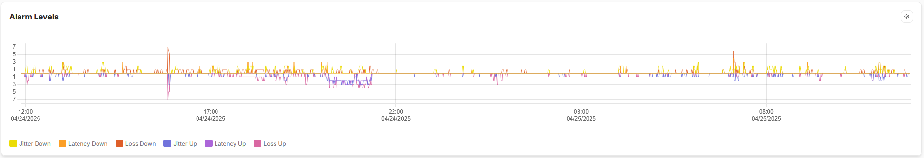
Health Alarm Levels
This graph is the most useful for troubleshooting. Bi-directional jitter, latency, and loss are plotted, along with the times they occur. An example of using this graph is in determining VoIP problems. VoIP is sensitive to jitter more than other forms of circuit degradation. If calls are choppy and one of the site's circuits exhibits high levels of jitter, you can isolate that circuit when testing, examine each hop in the route, and significantly expedite the resolution of the issue.
The example below shows a bi-directional loss at level 7, a complete loss of connectivity at around 15:00. Jitter (down is yellow and up is blue) is also high on this circuit. Additionally you can see a trend of upload loss starting at 17:00 and reaching it's worst around 20:00 before resolving.
Quality of Service (QoS)
The Performance page helps you visualize our QoS, offering additional insight into circuit performance beyond bandwidth, loss, and latency. It shows the mixture of traffic classification that contributes to traffic management on the WAN circuits. This feature currently shows QoS information only for the per-circuit throughput charts on the Performance page.
Hovering your mouse over the chart provides detailed information.
You can choose to only view certain types of traffic at a time by selecting the gear in the top right of the graph.
Wireless 5G/LTE
The 800W can also give you signal information for the 5g cell circuit on WAN4. It tracks the Reference Signal Received Power (RSRP), Reference Signal Received Quality (RSRQ), Received Signal Strength Indicator (RSSI) and the Signal-to-Interference-plus-Noise Ratio (SINR)
Comments
0 comments
Please sign in to leave a comment.